For the past several years, Scandi minimalism, with its sharp lines and bright whites, has had a death grip on the interior design world. But recently, maximalists have been thrilled to see the triumphant return of their beloved more-is-more aesthetic: flip through home magazines or scroll Pinterest or TikTok and you’ll be met with sumptuous textures, loud colors, intricate patterns, and gallery walls filled with mismatched frames, art, and objects.
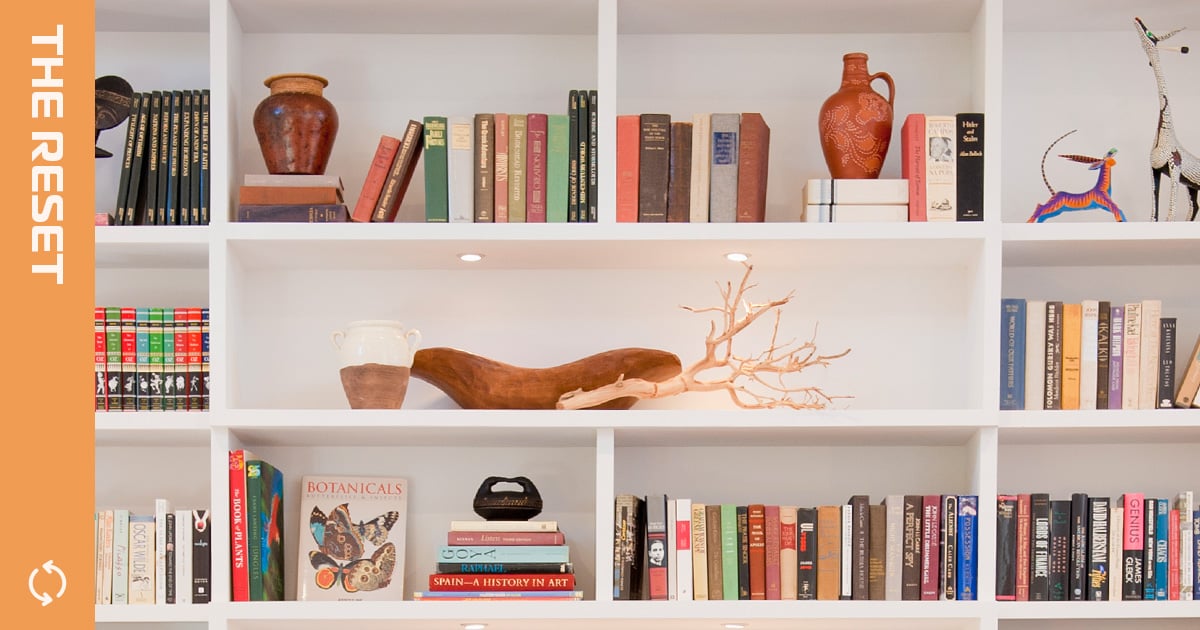
The latest subgenre of maximalism to grab hold of the public’s – or at least TikTok’s – attention is “bookshelf wealth.” Imagine you stumble into the personal library of a seasoned world traveler, with bookshelves overflowing with artifacts that mark their globe-trotting. Throw in some comfy seating, rich textiles, and funky art. Think of Meryl Streep‘s homey Santa Barbara bungalow in “It’s Complicated” and Kate Winslet‘s cozy cottage in “The Holiday.”
“The overall look of bookshelf wealth is abundance – and there’s something a little haphazard about it,” says interior designer Annie Elliott, the CEO and principal designer of her namesake firm, Annie Elliott Design. “It really plays into this maximalist, layered, cozy, personal look.”
Try to re-create this look without the help of a pro, however, and you run the risk of seeming more Miss Havisham than Nancy Meyers. Here, Elliott shares her top tips for nailing this lived-in vibe.
1. Ground the space with furniture that has heft.
Of course, the bookshelf is the anchor of this look – but not just any bookshelf. Floating shelves or bookcases made from metal or glass, for instance, are too airy for the bookshelf wealth vibe. Instead, opt for freestanding, large bookcases in rich wood tones that will add weight to the space. If your place has built-ins (or you have the means to add them), all the better.
2. Get creative with your book display.
Rather than a totally neat bookshelf with horizontal rows, arrange your books into interesting configurations on the shelf. Try turning some so their covers face forward, or stack them vertically. You could even add additional stacks on the floor next to the shelf to really nail that overflowing look. Don’t be afraid to pack lots of books in there, either.
3. Add vintage pieces.
Vintage items can help make it feel like your room is used and loved. Pepper in some cute glassware, dishes, and figurines on your bookshelves, and seek out pieces with interesting shapes. These don’t have to be big, expensive purchases; if you see a beautiful tray at a flea market, get it.
4. Choose – and arrange – your knickknacks wisely.
The bookshelf wealth aesthetic isn’t the same as being cluttered or messy. This isn’t an excuse to just jam any old thing onto your shelf or fill a room with stuff, Elliott says. “It’s a fine line between a space looking cozy and welcoming and a cacophony of color and pattern,” she says.
To make each shelf interesting, think about how each element you add contributes to the overall vision. “The keys are to add more to the shelves so there’s less empty space, and to think about layering rather than cramming things in,” Elliott says. “It means putting one object in front of the other, but not directly in neat rows.”
For example, you could place a large painting toward the back of the shelf and stack books in front so part of the painting peeks out; you could also place a trinket dish atop a stack of books that’s arranged in the center of the shelf.
The key here isn’t to rush to HomeGoods and purchase objects and art to fill space, though. To get a curated look that feels organic, Elliott recommends keeping an eye out for fun dishes, objects, picture frames, and more that you can use to fill the space over time. It may take a little longer to furnish, but it’s the path to creating a space that tells your personal story. “Picking up things you love is how you slowly develop a style,” she says.
5. Display art unconventionally.
Art is another key piece of this aesthetic. Elliott recommends checking garage or estate sales and vintage shops for oil paintings, frames, and prints. If you’re on a budget, you could also buy prints from online shops and zhuzh them up with a funky frame, or frame postcards, invitations, and greeting cards. (Elliott says a favorite piece on her own shelves is a beautiful wedding invitation.)
When arranging your art, avoid hanging the pieces in neat rows or matching frames. “You can hang it on the [front of the bookcase], you can put [paintings] on little brass easels and display those in and amongst the books, or if you’re lucky to have wall space on the sides, cram those with pictures,” Elliott says.
One mistake to avoid? Sprinkling many small frames all over the case with a lot of space between. “Small pieces tend to look better when they’re surrounded by other things,” Elliott adds.
6. Design beyond the shelf.
One jam-packed bookshelf is a statement piece, not an entire design. “If you are going with the true bookshelf wealth look, you’re treading into the maximalism look with the rest of the room,” Elliott says.
Layer antique or vintage rugs to make the space feel “rich and full,” and make sure textiles, like blankets and cushions, and upholstered pieces, like chairs and couches, feel cozy. Add in a reading chair, a tiny foot stool, and a cool vintage lamp. Use richly patterned wallpaper, too.
7. Mix and match patterns, colors, and textures.
The goal is for the space to look slightly haphazard and not perfectly matched. To keep everything cohesive, keep color as a through line and play around with scale. “If you have a big plaid pillow, pair it with a small floral pillow,” Elliott says.
Helen Carefoot is a freelance lifestyle, culture, and entertainment journalist based in Washington DC. Previously, she was a lifestyle writer for Well+Good and worked at The Washington Post on the lifestyle desk.


