Minimalism may not be dead, but Pantone is preparing for something louder.
The color authority has added 224 shades to the Pantone Matching System, answering designers’ growing appetite for saturated pinks, citrus greens, aquatic blues and other high-impact hues with colors engineered to make the journey from digital concept to physical production. The new colors are built for graphic and product designers, brands, printers, converters and ink manufacturers.
The expansion is Pantone’s first since December 2022, when the company also added 224 shades. Pantone said the latest additions bring its library to nearly 9,000 colors and span every color family, reflecting a broader turn toward maximalism and emotional expression.
The Pantone Matching System is a standardized, proprietary color reproduction system used globally in graphic design, print, and manufacturing. It provides designers, brands, printers, converters and ink manufacturers a shared reference intended to keep a color consistent as it moves among screens, samples, substrates and finished goods.
That discipline becomes more important, Pantone argues, as brands use increasingly assertive colors and combinations to create specific emotional effects.
“Designers and brands are embracing color as a form of confidence and bold expression, focusing on the way it makes their audiences feel,” said Cindy Cooperman, general manager and vice president of Pantone. “The new colors expand the expressive range of the entire system, adding to this trend of bold feeling and excitement.”
The new colors will be a part of Pantone’s Formula Guide, Color Bridge and Solid Chips Set on coated and uncoated paper stock. The company is also offering supplemental guides and chip pages for a limited time so existing customers can update their collections without replacing them in full. Digital versions are available through Pantone Connect and its extension for Adobe Creative Cloud.
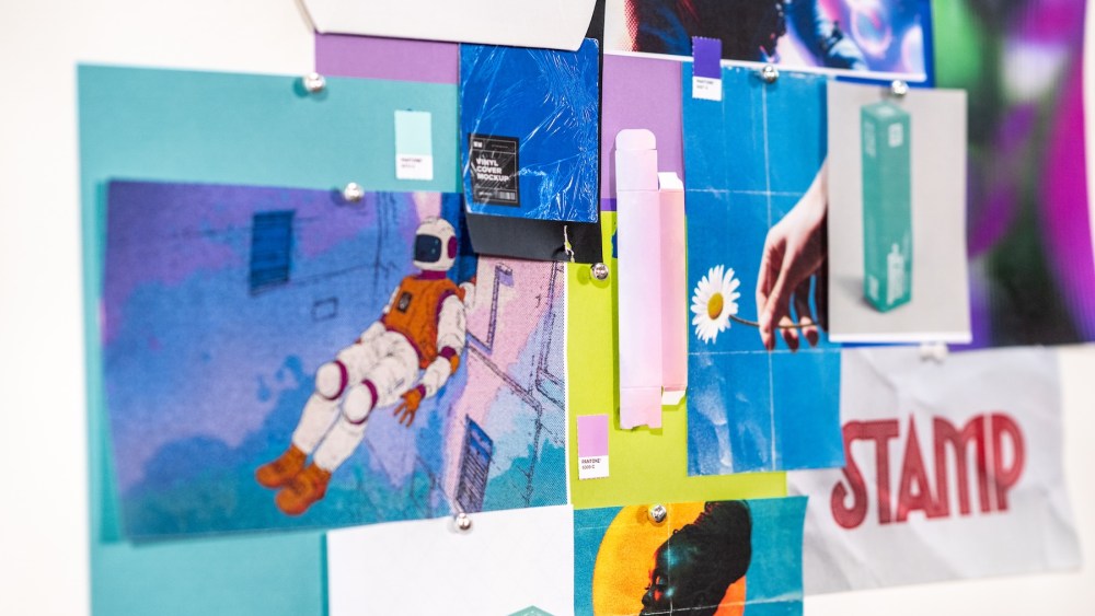
Pantone grouped 20 of the new shades into four trend palettes demonstrating how its forecast for bolder color can take several markedly different forms.
“Desire for Pleasure” pairs playful pinks with aquatic blue and pistachio green in a confectionery palette Pantone describes as “sickly sweet.” “Desire for Exquisite,” meanwhile, combines chocolate and grape tones with peach, deep red and vibrant orange to evoke opulent flowers and ripened fruit.
“Oxygenating” draws on golden amber, neon citrus and botanical greens to suggest living ecosystems and transformation. “Beyond Boundaries” is the quartet’s retro-futuristic outlier, bringing together aqua, powdery lavender, purple, lime green and creamy beige in a combination intended to feel simultaneously nostalgic, playful and scientific.
The broader collection extends from pink-infused reds and romantic roses to floral, fruity and earth-derived oranges. New yellows move between musky and citrusy, while additions to the cooler end of the spectrum include restorative greens, meditative blues and purples ranging from dusky to glamorous. Browns, taupes, neutrals and changeable grays ground the more energetic hues.
Developing those colors required Pantone’s trend forecasters to work alongside its color scientists, pairing cultural signals with the technical demands of creating stable, repeatable standards. The company did not disclose data quantifying the shift toward maximalism or elaborate on how the two groups divided the development process.
Color in practice
Pantone gave graphic designer Aaron Draplin early access to test the additions in an actual working process. The Oregon-based founder of Draplin Design Co. is known for his unapologetic use of color across work for clients including Nike, Patagonia, Hot Wheels, Pearl Jam and Chris Stapleton.
The biggest surprise was purple, a color Draplin admitted he has “been known to publicly disparage.”
“Hard to mix on press, the color of royalty and the unofficial color of creepy cat people,” he said. “I know, I know, I’m horrible, but facts are stubborn things.”
Trying it proved “fun and flummoxing, but also fertile,” Draplin said. “I discovered a new side to my design self, and that was awesome.”
Draplin views Pantone’s expanded range less as an invitation to deploy every available shade than as a larger toolbox. He compared discovering an unexpectedly useful color to finding an unusual pair of pliers that finally allows him to fix a leaking dishwasher connection.
“These are all just tools,” he said. “With this project, I got to try some new colors, and it took me new places. It was fun to let go and see what came out of it.”
For Draplin, “flipping the script” meant relaxing the self-imposed guardrails that had accumulated over years of working within an established visual style. “It simply means opening the wavelength and being open to trying something a bit riskier,” he said. “It was fun to take some wild exits. And then commit. And the pieces turned out awesome.”
The result is a collection built around a seeming contradiction: giving designers more room to abandon restraint while imposing tighter control over how their choices are reproduced.
Pantone’s additions may promise creative freedom, but their commercial value rests on precision. A shocking pink can only make the intended statement if it remains the same shocking pink when it leaves the designer’s screen. Technical consistency, however, need not preclude experimentation.
“Sometimes you gotta get loose and wobbly,” Draplin said, “and that’s where some magic can happen.”