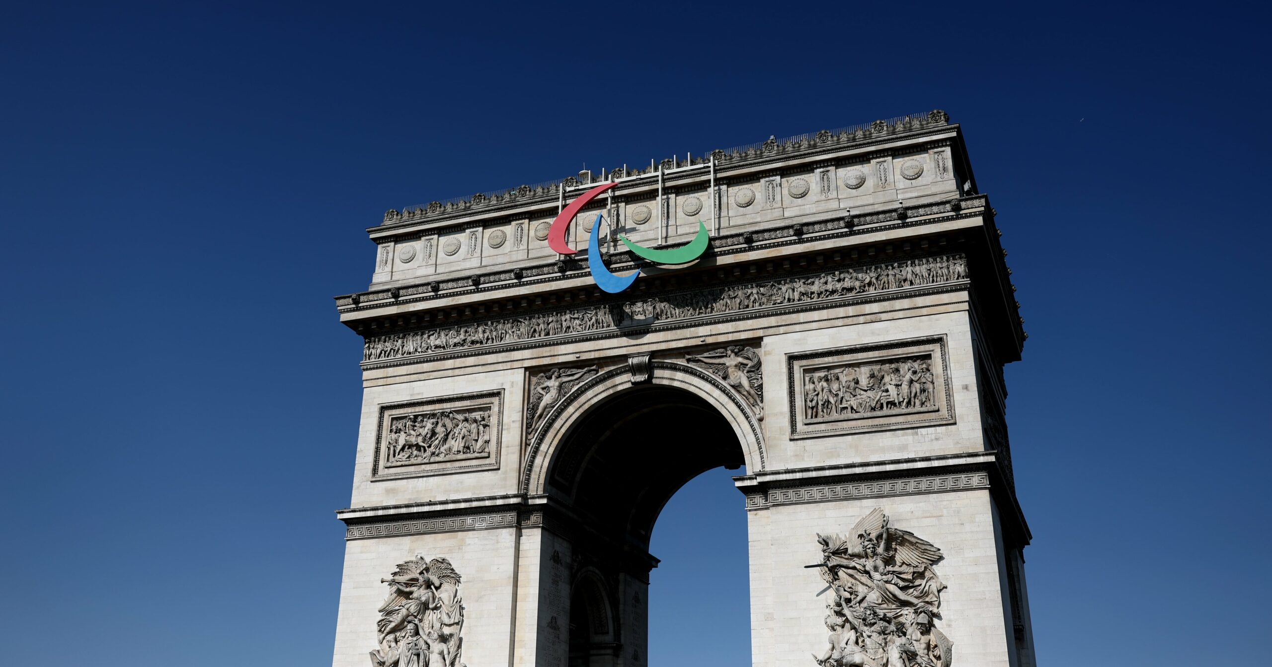
The Olympic rings are unmistakably iconic, as recognizable as the Nike swoosh or golden arches. And although it was designed much more recently, the Paralympics Agitos has become equally as recognizable. But you may have wondered why the Paralympics and Olympics don’t share a logo.
Well, there is a reason for the distinction – and it’s probably not what you think. Here, we dig into why the Paralympics logo is different from the Olympics logo, and what exactly it represents.
What Does the Paralympics Logo Represent?
The Paralympics logo consists of a trio of simple crescents circling a central point, and there’s a lot of meaning and history behind it.
It consists of three colors – red, blue, and green – which are the three colors that most widely appear in national flags across the globe, according to the International Paralympic Committee (IPC) website.
As for the symbol’s name: the term agito means “I move” in Latin. The word and their positioning is intended to symbolize motion and emphasize “the role of the Paralympic Movement in bringing athletes closer together from all corners of the world to compete and achieve sporting excellence,” according to the IPC. “The symbol also emphasizes the fact that Paralympic athletes are constantly inspiring and exciting the world with their performances: always moving forward and never giving up.”
Why Is the Paralympics Logo Different From the Olympics Logo?
Frankly, it all comes down to legality. The International Olympic Committee (IOC) shuts down any symbol that resembles the Olympic rings, or anyone trying to use the actual Olympic rings for alternative purposes other than the games, reports Metro UK.
In fact, the original Paralympics logo – first used at the 1988 Paralympic Games in Seoul, Korea – shared a lot of similarities with the Olympic rings. It incorporated five symbols – modeled after the Tae-Geuk, a Korean motif that represents the ultimate reality from which all things and values originate – in similar colors and configuration to the rings. However, this was only used until 1994 when it was deemed too much like the Olympic symbol. From there, the Paralympics logo shifted twice more before reaching its current design in 2019.
The logos aren’t the only things that are different about the Paralympic and Olympic Games. The two events have different dates, governing bodies, structures, and even missions. But at the end of the day, both emblems are rooted in the same meaning: unity. And that’s a value we can definitely get behind.
Kristine Thomason is a lifestyle writer and editor based in Southern California. Previously, she was the health and fitness director at Mindbodygreen and the fitness and wellness editor at Women’s Health. Kristine’s work has also appeared in PS, Travel + Leisure, Men’s Health, Health, and Refinery29, among others.


