MILAN — Aesop’s first official partnership with Salone del Mobile was only a question of time.
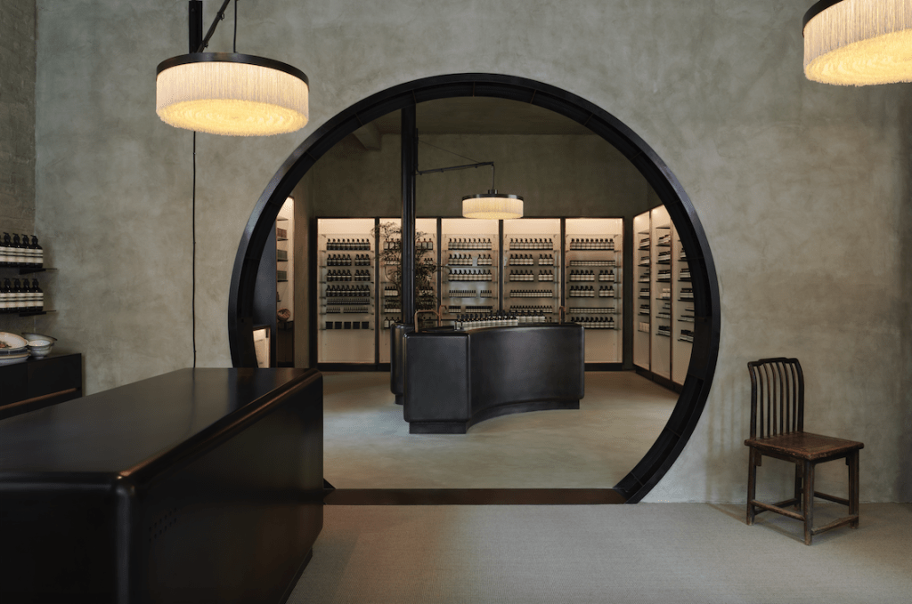
The Australian luxury personal care company made an art out of design as much as out of its formulations, thanks to the clean aesthetic of its signature amber bottles with black-and-cream striped labels and its site-specific retail concepts, which surprise — and draw — customers each time with different interiors in tune with local neighborhoods.
Without betraying its understated ways, the brand is looking to restate its expertise in all-things design by leveraging a dedicated event here and condensing different activations within the week.
The main one is the opening of its new store in the city, which will add to the existing units in the artsy Brera district — which marked Aesop’s first Italian unit in 2015 — and in the Magenta neighborhood.
To be unveiled on Tuesday and nestled a few steps away from the central Piazza Cordusio square and the Duomo cathedral, the new location will perpetuate the brand’s retail philosophy by boasting a design inspired by Milan’s subway.
“As always for all our stores, this one responds to the context, too,” Marianne Lardilleux, Aesop’s head of store design, told WWD. She nodded to the proximity to the Cordusio subway station and the city’s first subway line that opened in 1964.

“We got inspired by this. Our other stores are very connected to the district where they are. We thought this one will open up new lines of connections between Aesop and the citizens of Milan….I really loved this idea of the metro and the new connections it could create, so we got very much interested in the design of the station and materials such as rubber, stone and metal tubing that could help us to transform our store into a futuristic and ergonomic composition,” Lardilleux said.
Developed by Aesop’s in-house design team, the store will welcome visitors into a tunnel of studded rubber and modular elements that could adapt to the space’s different needs. Industrial and functional details running across the ceiling will be highlighted in red rather than hidden, while an expansive linear basin — an interpretation of the public wash station — promises to invite passersby to linger while testing the brand’s products.
Through a central portal, a sort of an intimate subway carriage, will offer an ample velvet seating booth and two individual basins dedicated to more in-depth explorations of the Aesop range.

For design week, the brand’s own products will be elevated to an artier level, too. To mark the opening, the company tapped Belgian architect Nicolas Schuybroek to develop an installation that will see Aesop’s body cleansing slabs form the building blocks of a literal soap salon. Each bar will hover in a monolithic grid formation, supported by a slender timber structure that can be disassembled and reused in different locations after the end of design week. Peepholes in the structure will reveal videos dedicated to the label’s products.
“We’re very much inspired by art, cinema and design. We contacted Nicolas and he was happy to work with us on this installation, which nods to the Arte Povera movement from the late ‘60s and ‘70s, where everyday functional items were used in an expected ways,” Lardilleux said. “So of course he used our soap as a pattern to build this wall all around our new store.”
The structure will also become the stage of a “soap opera” — pun intended. An Aesop therapist will enact a live performative facial treatment at 5:55 p.m. CET each day to demonstrate the brand’s approach to self care via a choreography of moments ranging from cleansing and exfoliating the skin to massaging and hydrating it. Magnifying mirrors and a theatrical voiceover narrating each move will add to the drama.

At the same time, Aesop will debut its Aromatorium format, with three compact booths traveling different areas of the city to dispatch fragrance and guide Salone del Mobile’s visitors via Aesop-devised maps highlighting works by emerging designers or recommending where to eat.
A panel discussion on design will be additionally held on Wednesday and involve Lardilleux as well as the company’s founding member and chief customer officer Suzanne Santos and Jean-Philippe Bonnefoi, Aesop’s head of retail design, Europe and global innovation.

“There’s one sentence that we use and that I really like: that Aesop is well-considered design, improving lives in the same way our products improve the skin care routine,” Lardilleux said when asked about the overall role design plays in the company. A French architect with previous stints at Louis Vuitton and Céline under her belt, Lardilleux first joined Aesop in 2016 as store design manager for the Americas in New York before being promoted to her current global role in 2020.
“What I’ve learned here is how architecture can help to host people and make them comfortable in the space, so how to create an intimate environment where people will feel comfortable to speak about their skin,” Lardilleux continued. She summed up the design ethos of the brand as “harmonious, immersive for the experience we give and non-conformist, because what we do, nobody does it.”

Lardilleux and her team are already working on the next projects, as the company — which last year was acquired by L’Oréal from Brazil’s Natura & Co. in a deal that valued Aesop at more than $2.5 billion — is rolling out further locations in the U.S. and Asia this year. On Monday the brand will also cut the ribbon of its new Parisian unit on Avenue des Ternes.
While Aesop’s definition of luxury has always shied away from scarce materials or design grandeur — playing on the subtraction of elements rather than addition — in recent years the in-house design team has become increasingly focused on monochromatic and multitextural techniques.

Recent openings further built on the brand’s retail diversification approach. In China, the store in Chengdu’s Taikoo Li drew inspiration from the local penchant for serene living to offer a minimal sanctuary juxtaposing the urban environment and botanical elements. Meanwhile, the unit in Guangzhou’s Dongshankou area aimed to mirror a home, with a main room akin to a large kitchen and dining room.
Both opened last month, new units in North London’s Islington neighborhood and in Los Angeles’ Beverly Drive couldn’t be more different either. The former nods to the area’s commercial history and the city with London yellow bricks spanning the floor and counter units and plywood shelving and drawer fronts varnished to match their tone. The latter oozes a cinematic vibe even in its minimal aesthetic, with rooms evoking a set or an intimate space more akin to backstage and furniture recalling the ‘60s and ‘70s.

Asked if instant recognizability can be lost in the lack of design uniformity across stores, Lardilleux said the company is “very lucky, because it’s not only about visual but all senses.”
“We always say that Aesop is smelled before it is seen. You could be walking in the street and at some point, you smell it and [think] there must be an Aesop store around there,” she said. “And even if all our stores are different, we always offer the same luxurious experience all over the world. It’s all about hosting people….Plus, something that helps us as well in our packaging: the color, the labels — they are all the same. And the abundance of it in our stores help people recognize our [units].”

Lardilleux pointed to the same generous approach — in addition to creativity and sensitivity — as key criteria in selecting external designers to collaborate with. Throughout the years, Aesop has worked with the likes of Milanese architect Vincenzo de Cotiis and hip design firm Dimore Studio; Studio Luca Guadagnino, founded by the acclaimed Italian movie director; São Paulo superstars Fernando and Humberto Campana; Oslo-based design studio Snøhetta, and London’s Al-Jawad Pike, to name a few.


